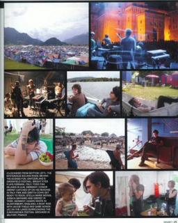
First, if you insist on using "clockwise" as a directional designator (even though there are images in the center of the "clock" - as if any clock hand, after moving through the twelve hours, then leaps to the center for a couple more hours), why start the "clock" at the "lower left" image, instead of the far more intuitive and typical upper left? Especially when the "lower left" image is not, in fact, in the lowermost row (since the lowest, leftmost area of the image is the captions themselves).
This design also forces the reader to jump back and forth between the image and a difficult-to-parse (because unnumbered) area of text. Frankly, I doubt I would have figured out which image is which if the visual content in some cases didn't tell me which caption went with the image.
It would have been much smarter either to place the captions directly beneath each image, in between the images in the black background areas; or to number the captions and images correspondingly.
-- -- --
In an amusing and unrelated note, it would appear Christopher Hitchens and his ilk are having their way with the language: in the article that goes with these photos (a tour diary from Jacob Thiele, keyboard player for the Faint and Bright Eyes), it's noted that recent editions of the game Risk have replaced the word "conquer" with the word "liberate."
Subtle move, Parker Brothers. I suppose Monopoly is now going to be called "Stimulating the Economic Recovery By Generating Supply-Side Capital to Grow the Ownership Society" or something?


No comments:
Post a Comment